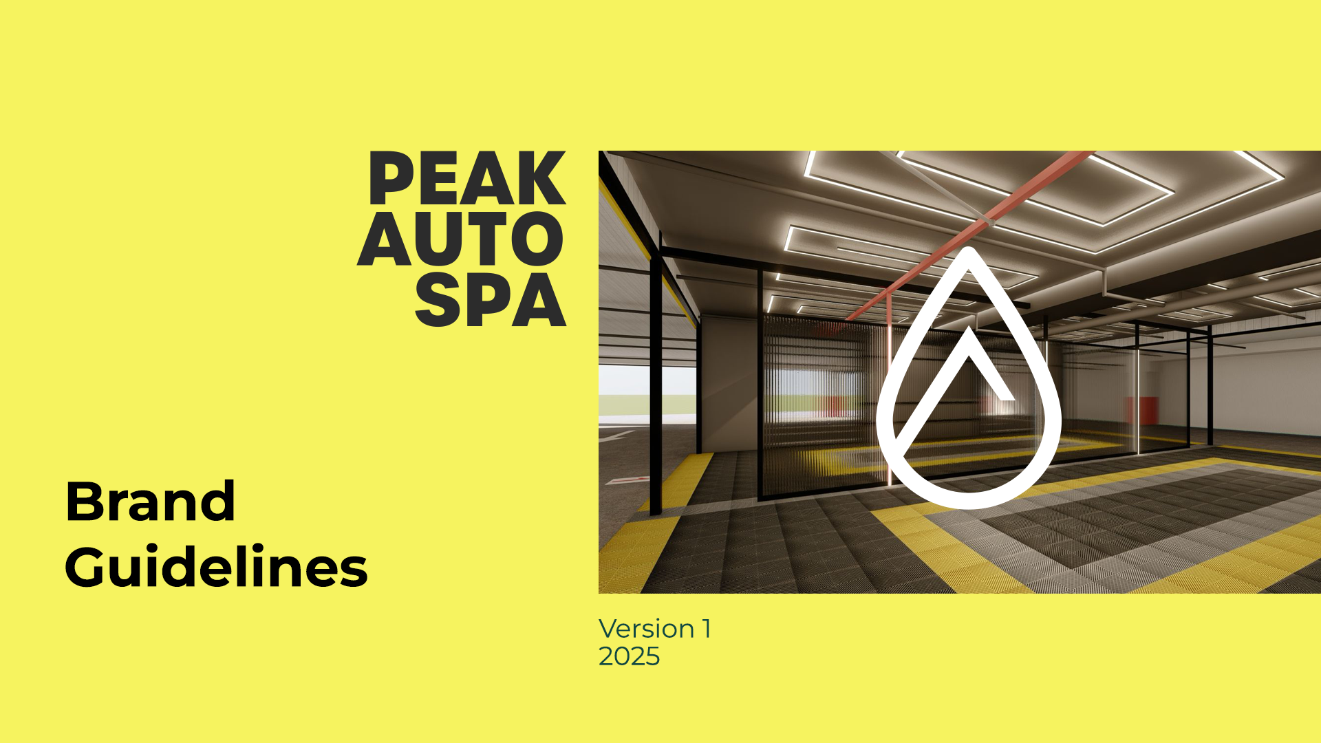
Case study
brand identity
PEAK AUTO SPA
Context
It's a new business.
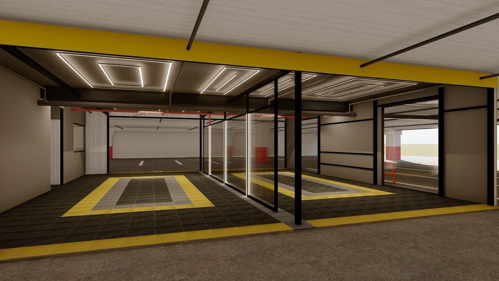
A premium car wash in Cluj-Napoca, that offers a few extra services, compared to the standard ones.
It was a project for Franc Agency, as the car wash is their client.
Objectives - business needs
The requirement was to create the visual brand identity (logo, color palette, fonts, brand manual), along with a few final materials for use (flyer, outdoor billboard, indoor pricing board, and a promotional card).
The client already had the name.
And for the logo, they had come with an existing proposal, that besides incorporating the name, also featured a mountain as a logo symbol.
In the end, we settled on an icon version, that combines the mountain symbol, with a minimalist water symbol—a drop.

starting point
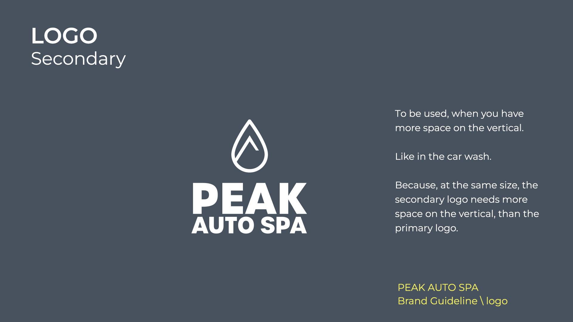
Logo
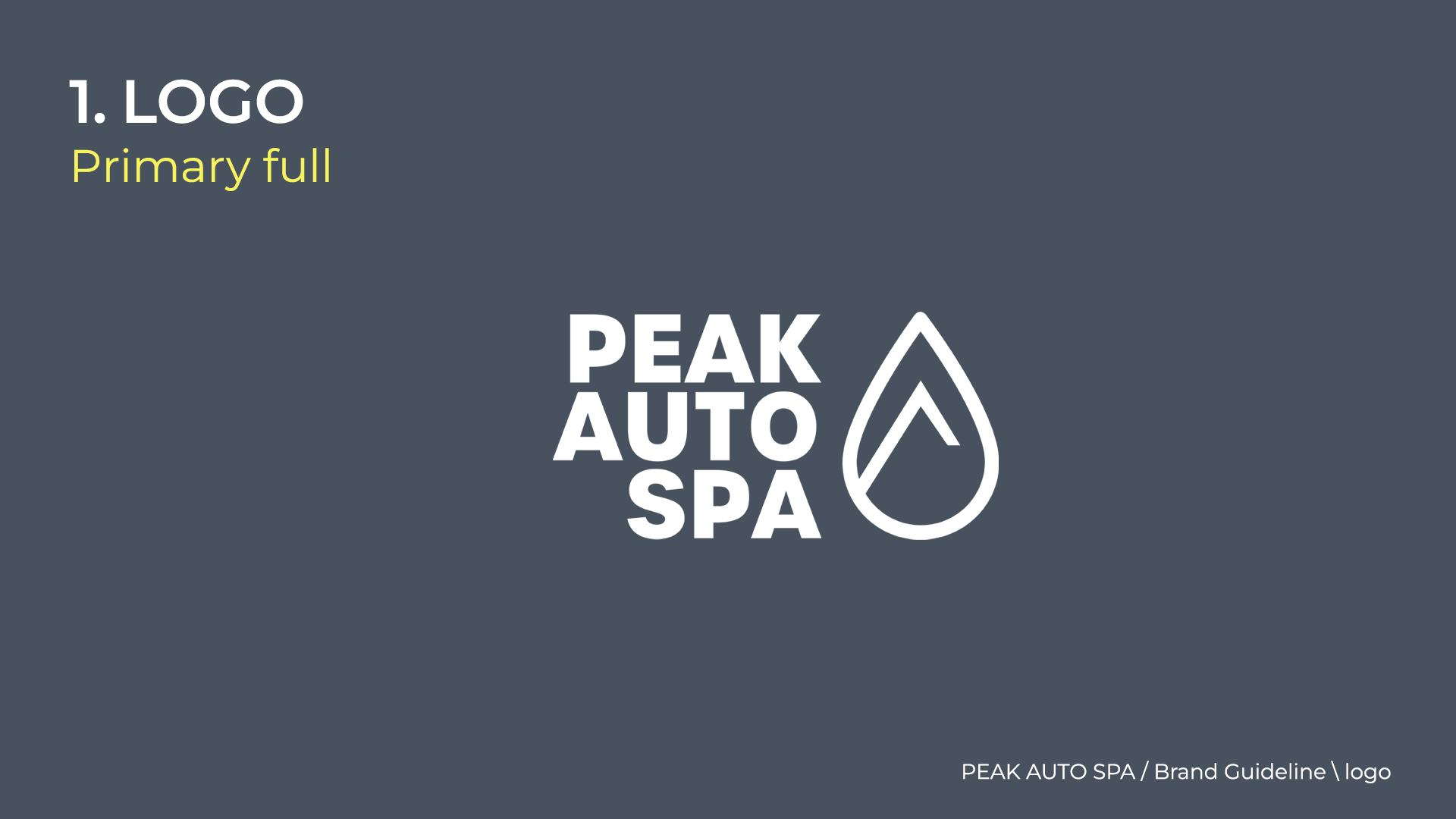
Icon

Is the symbol for a water drop.
To be used only in this position, because in other positions it could communicate something else, like the symbol for location.
Inside the water drop, is the symbol for mountain, and the in same time, is associated with the peak of a mountain.
PEAK AUTO SPA is the place, where your car receives all the services needed, beyond washing.
In the same time, is the peak of quality.
Brand colours


Typography

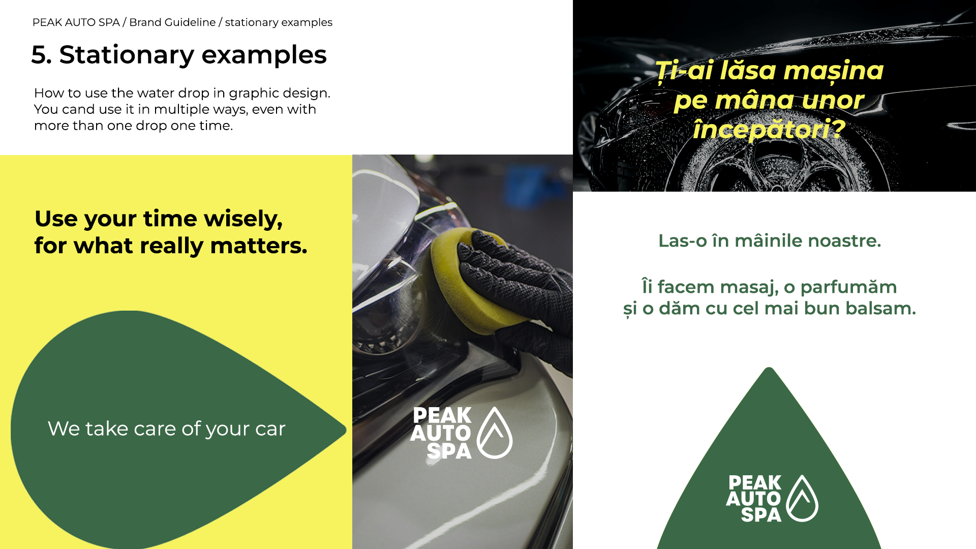
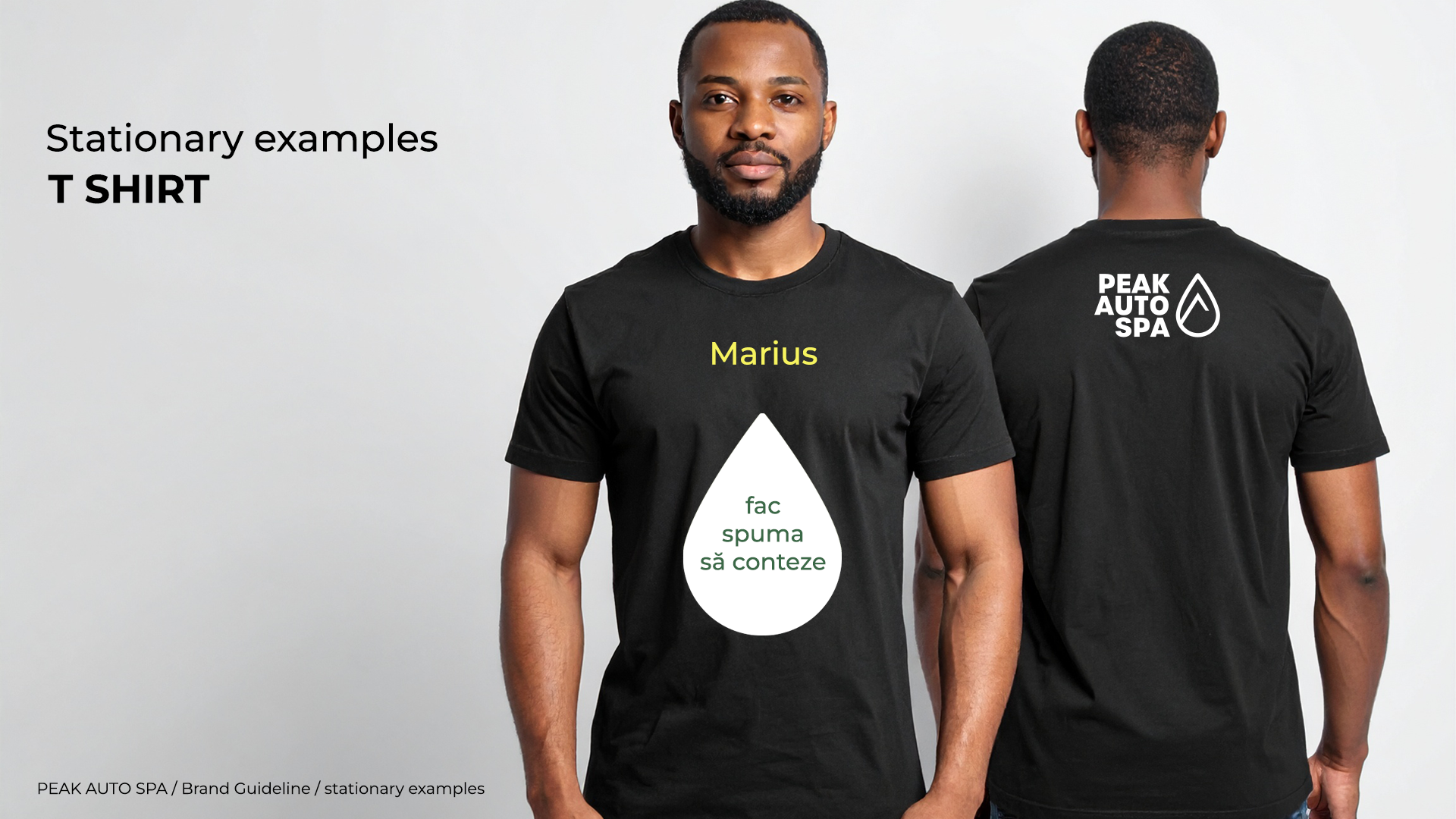
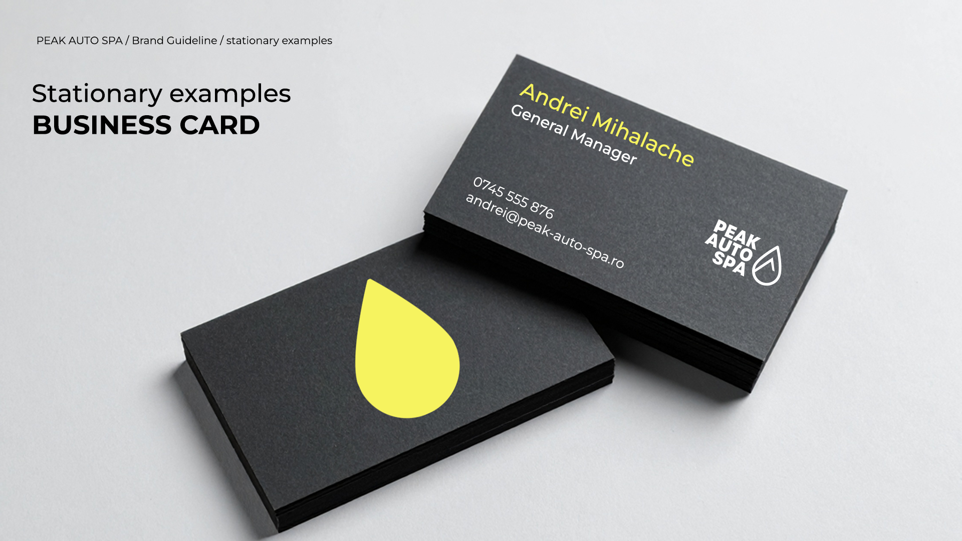
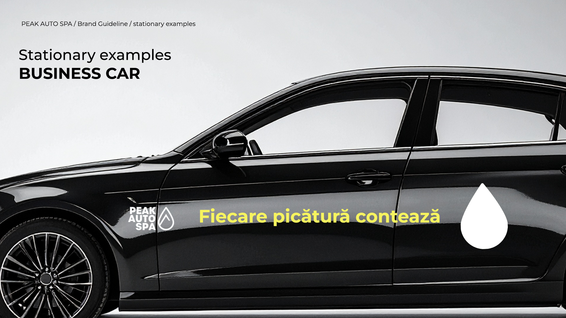
Picture mark / icon role in graphic design
A simplified version of the icon, the simple water drop filled inside, can be used in design.

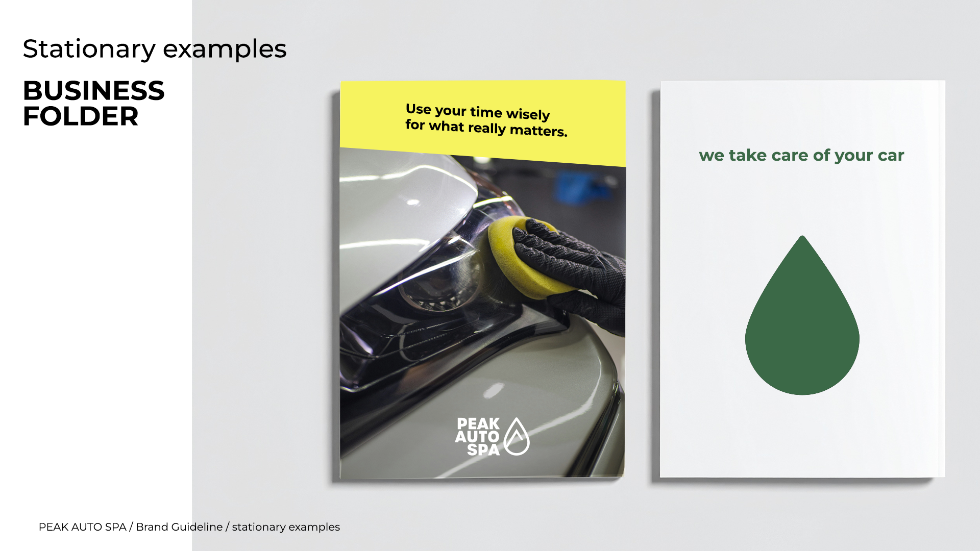
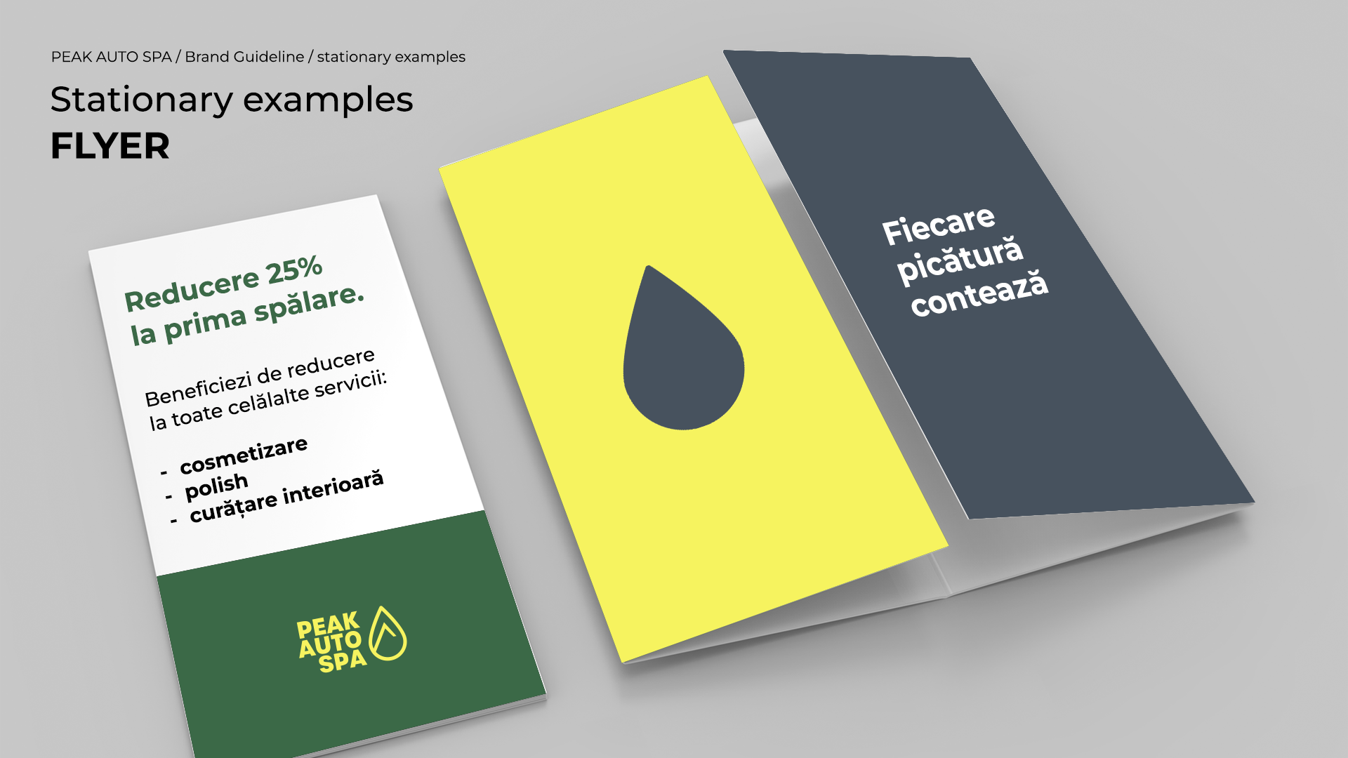
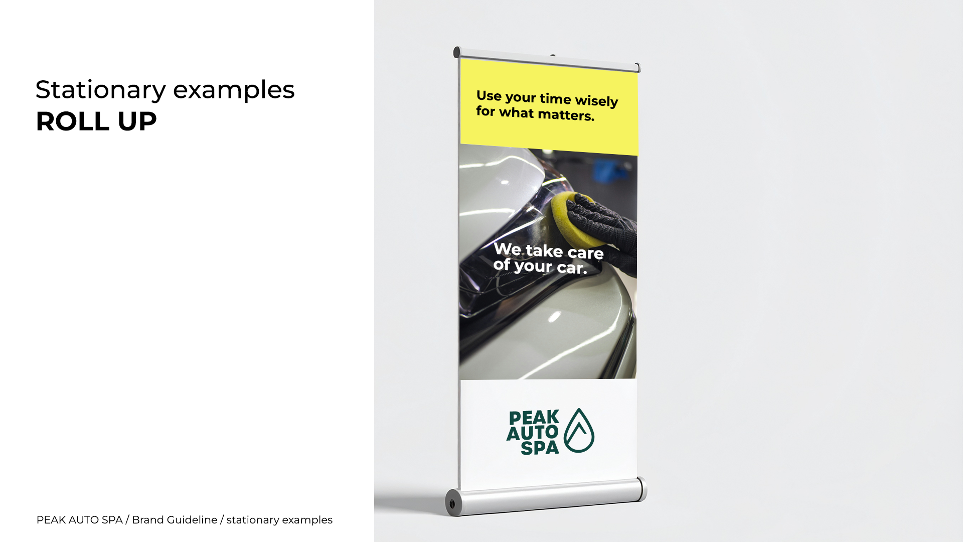
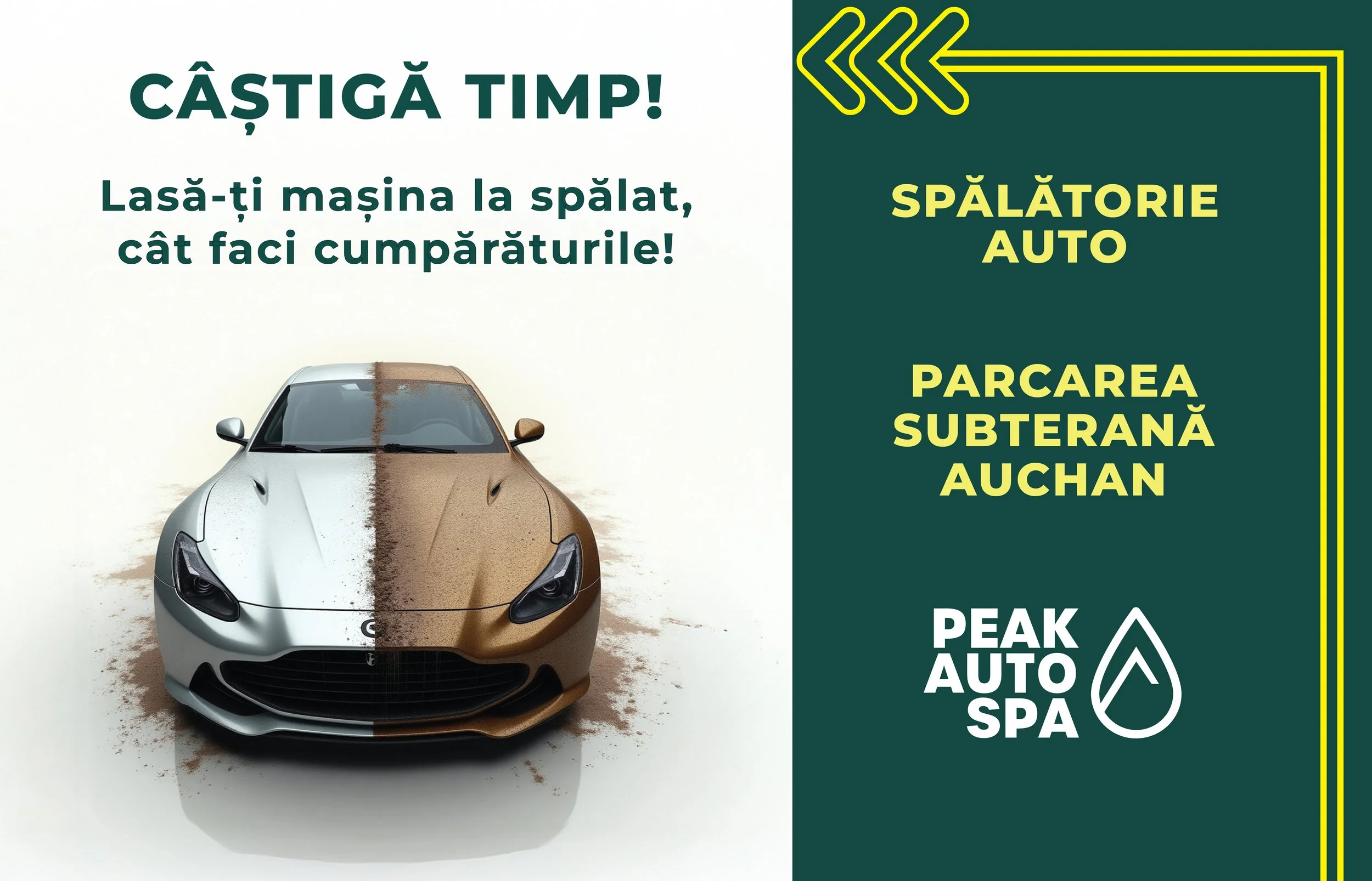
Stationary examples