Brand identity - Marketomize
It’s an agency that truly brings something new.
We’re talking about the first Lean Strategic Marketing model in Romania.
Beyond the classic marketing component, the new element focuses on optimizing spending and maximizing results.
We went with a modern, minimalist, “mathematical” identity meant to convey seriousness, innovation — modernity, measurability, precision, and efficiency.
The deliverables were:
Logo
Additional symbols for use
Brand colors
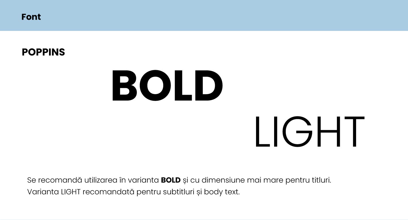
Font
Mini brand guide
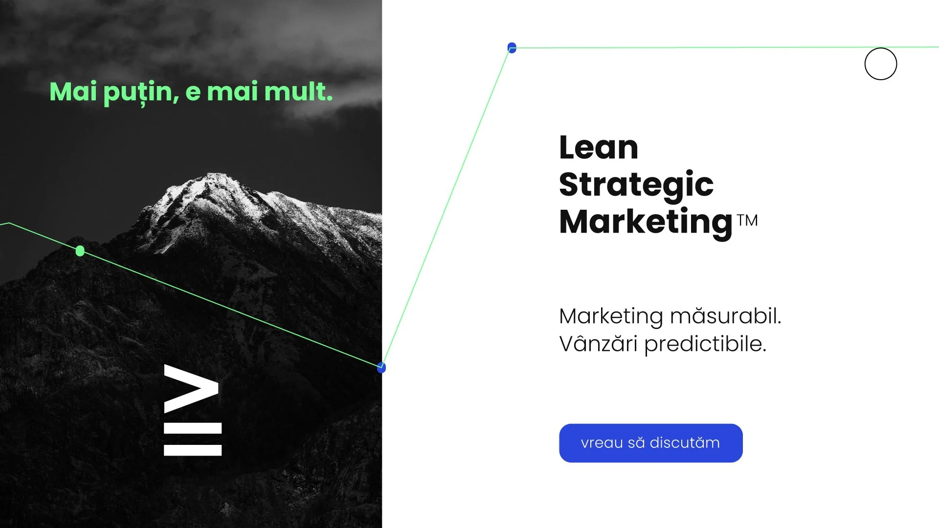
Hero page for the website
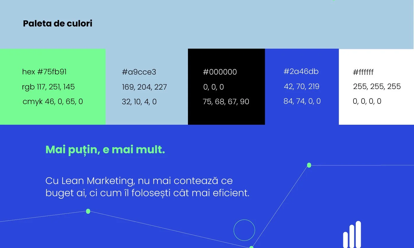
The color palette leans toward a modern, energetic, and vibrant design, especially through the blue and green used.
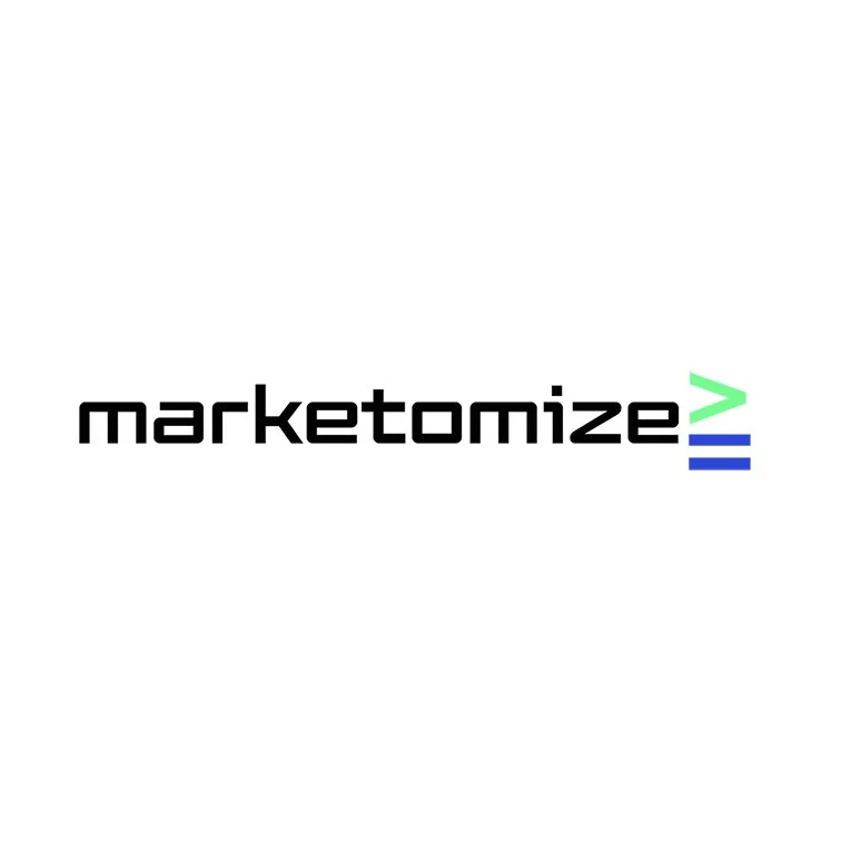
The wordmark font (marketomize) evokes Japan — one of the main sources of the Lean and Kaizen concepts.
In this way, it balances the modern, lively perception of the color palette with something more serious and precise.
The icon (the “greater than or equal to” symbol) also supports the ideas of seriousness and results, while suggesting that the client’s business will grow when working with Marketomize.
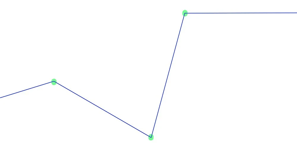
On top of all this, the brand identity includes several symbols that can be used in design.
They reinforce the messages found in the logo.
An oscillating chart that ultimately still suggests growth and stability as a concept.
And a rising-line symbol that evokes evolution and growth.